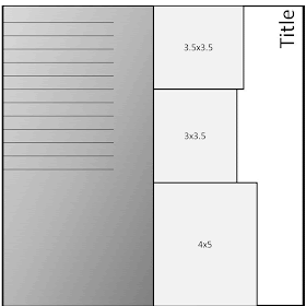
First, in creating the sketch.
I have basically no photoshop skills.
But, my previous career taught me a thing or two about powerpoint, so that's what I relied upon for this whopper of a sketch.

Then, to make matters worse, I don't typically scrap from a sketch.
So, once I created it, I was stumped again! What photos to use, how to arrange the products so that my sketch doesn't look totally defunked.
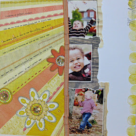
Then, all of a sudden, I came up with this.
So happy with the outcome.

Supplies: Studio Calico October Kit Yearbook - Raja Gold Flower Centers (Prima), Patterned Paper (Sassafras), Paper Whimsies (Sassafras), Ribbon (American Crafts), Frames (Kitschy Digitals), Stamps (Studio Calico)

These photos were taken at a recent trip to Jackson's orchard before Halloween. It was a perfect cloudy day, so there wasn't harsh, direct sunlight. And, since I'm new at shooting in manual, it was nice because once i metered in one spot, I didn't have to meter again and again and again.
To doctor the photos, I ran Maggie's Simple Color Boost action at 100%. It's the easiest action for me to run when I don't have time to think about it or spend all day editing photos. Usually it looks good at 100% on all the photos I take. Thanks Maggie!!!
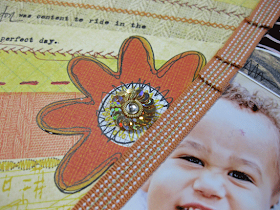
The most difficult part of the layout was typing on the angle. I tore my paper slightly in the process, but it was nothing a carefully-placed-ribbon couldn't fix.
Oh my April, I think this is my most favorite layout you've ever done. I LOVE the sketch. I am not one to follow sketches, but I may lift this. Gorgeous, just gorgeous!
ReplyDeleteLovely Design. I am a PowerPoint gal myself as well. I have not quite been bitten by the digital bug.
ReplyDeleteI would also be challenged! Congrats on your great sketch and layout!
ReplyDeletegorgeous layout!!!!
ReplyDeletetara
Love it!
ReplyDelete